Our 1W1901-V is a 540 square foot Single Section home. Features two bedrooms one bathroom, a perfect retreat for your family. Excellent curb appeal, with great function inside the home! Check out the details here.
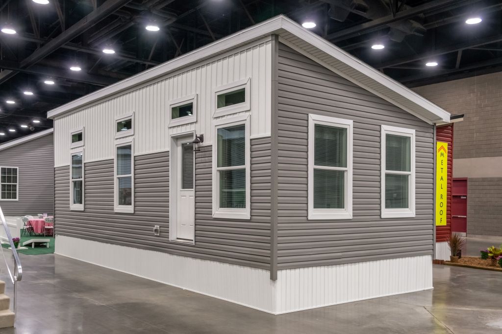
Our 1W1901-V is a 540 square foot Single Section home. Features two bedrooms one bathroom, a perfect retreat for your family. Excellent curb appeal, with great function inside the home! Check out the details here.
Color is taking a front seat in all aspects of design today. The pictures below are from random publications but all have a central theme, bright colors. The room scenes have pulled their colors from the artwork shown, and the front door area is picking up the colors from the mat. It’s interesting that all three feature shades of teal and yellow which plays nicely off the neutral gray and beige of the walls. Whether you’re freshening up a room or starting from scratch, start with a piece of artwork or a print you love and pull the colors from it into the room. You’ll end up with a very polished look and a room you love.
Debbie Stutsman
Corporate Director of Design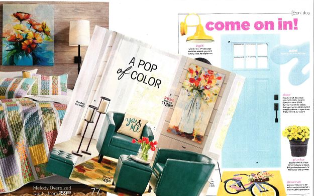
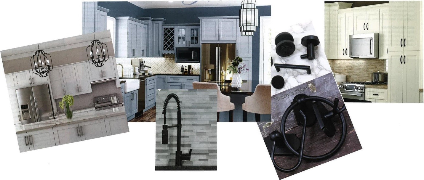
Trending today…there is a lot happening with finishes. Painted cabinets are everywhere, grey tones and white are the most prevalent, but there are some strong colors being shown also, dark blue and even some green were seen at the recent IBS show. Matte black has become a player in finishes for everything from cabinet hardware, faucets and lighting. The nice thing about this is, it blends well with brushed nickel, stainless and chrome. Black cabinet door hardware looks great on the painted finishes, while black lights add a nice contrast in a kitchen with brushed nickel & stainless.
Look for these featured finishes in our product offerings!
Debbie Stutsman
Corporate Director of Design
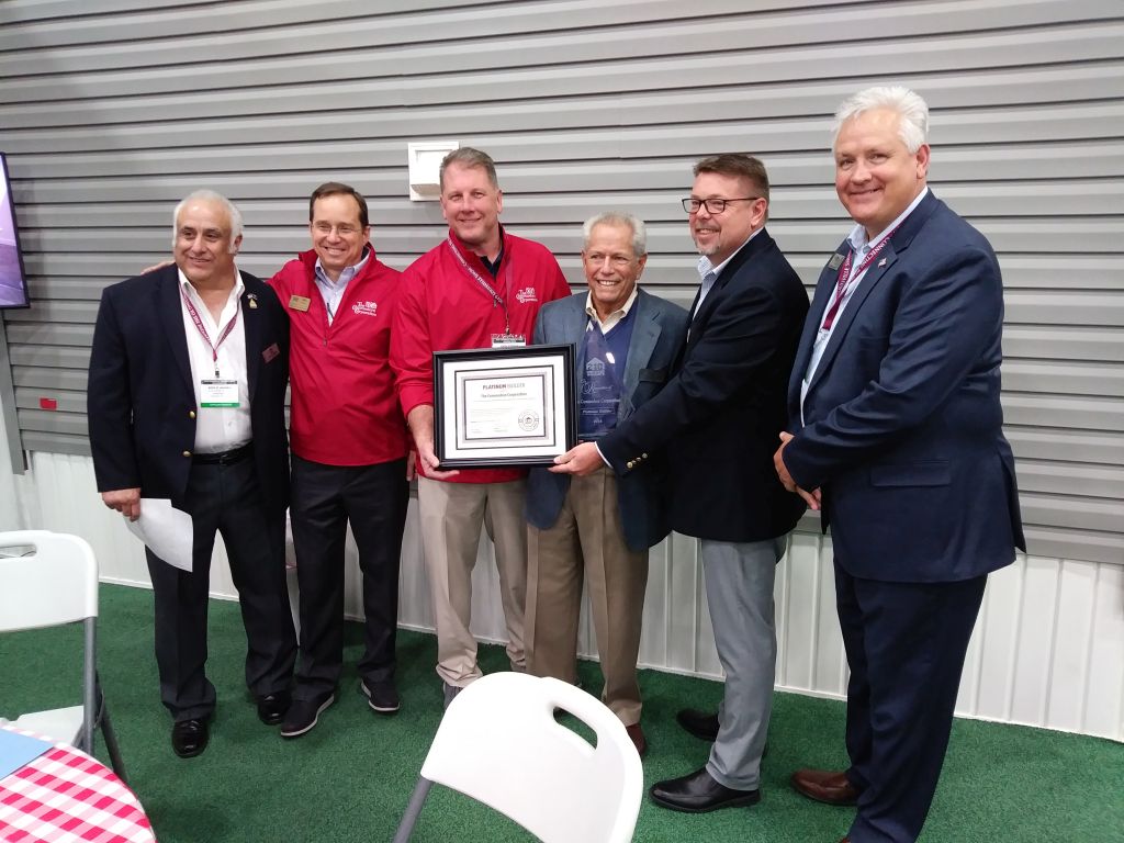
2-10 Home Buyers Warranty recognizes The Commodore Corporation as a Platinum Builder for 2018!
The Commodore Corporation is proud to accept this award from 2-10 Home Buyers Warranty!
The award is described as below:
The Platinum Builder Award Recognizes accomplished builders who demonstrate leadership in new construction with innovations in design, marketing strategy, and construction technology. These builders think big while remaining committed to provide the personal touch that connects home buyers to the communities in which they build.

DESIGN NOTES:
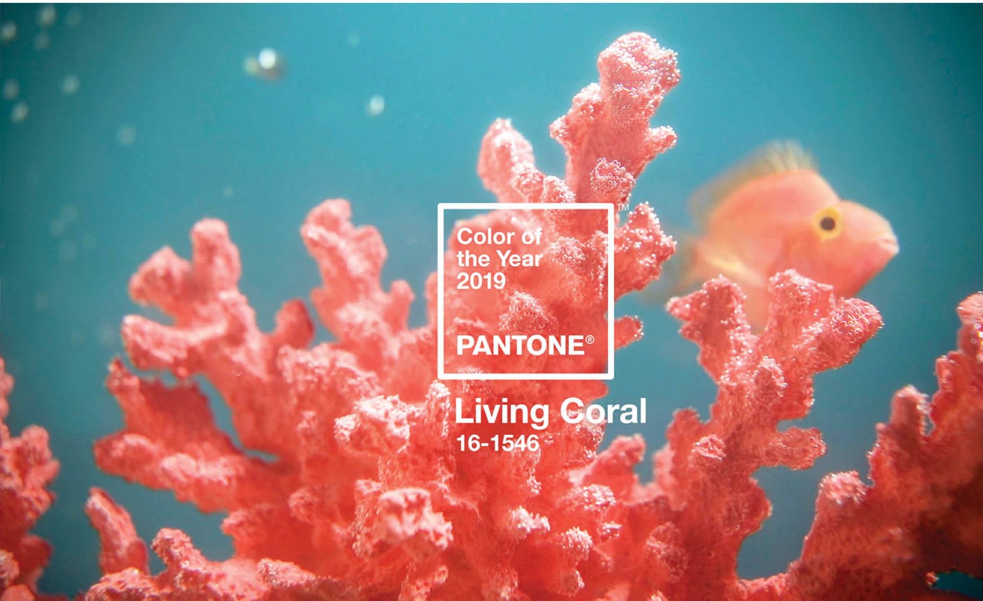
The end of the year always heralds the announcements for “The Color of the Year” by various paint companies and those who specialize in forecasting color trends. The color palette seems to be getting warmer for both fashion and interiors. Pantone’s color of the year “Living Coral” is a vibrant color and is already influencing the fashion world.

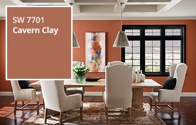
Sherwin Williams’ color of the year is “Cavern Clay” which is a nice soft version that can blend with many other colors including some of the gray colors. It makes a nice accent wall and is not overwhelming in a whole room.
You may want to consider adding pops of the 2019 color of the year to your interiors to warm up the look.
Debbie Stutsman
Corporate Director of Design
The Commodore Corporation
A successful Builder Show has just completed at our location.
Our new FLoorplans, Options, and Decor Selections will be available in late January for ordering!
Keep checking back for our new Photos, Videos, Tours, and more!
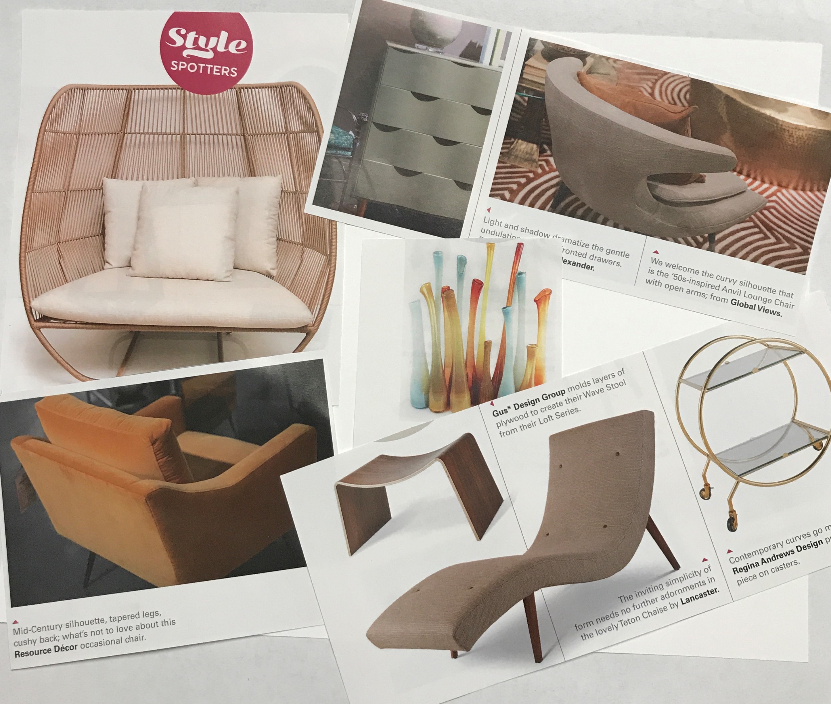
They have always said that design goes in cycles, and the new cycle is trending to mid-century modern. Think clean lines, lighter feeling furniture, channel that “fifties look”. With the fall furniture market this year we are seeing this influence. Curves are everywhere and they are showing up everywhere from upholstery to case goods, even in lighting and accessories. There is a resurgence of wicker, rattan and caned furniture. These organic pieces add warmth to any interior and keep any interior from looking too harsh.
“Color blocking”, using a bold color on a single wall or piece of furniture, is softening with more pastel tones and subtle patterns and textures. There is also more use of earthy tones in rust, copper and soft gold, which blends with the appearance of brass and gold tone hardware.
The “farmhouse/shiplap” look is still strong but does show signs of starting to trend down. Younger buyers are looking at other clean looks to define their spaces and the mid-century look fits their style. Here is an overview of some of the new looks at this fall’s furniture market:
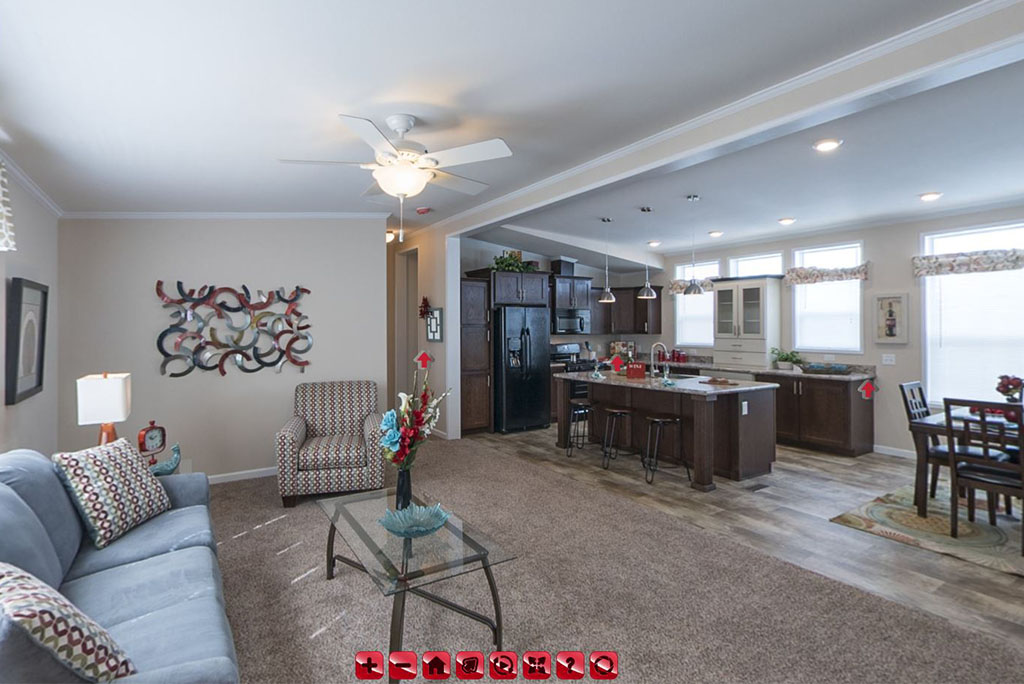
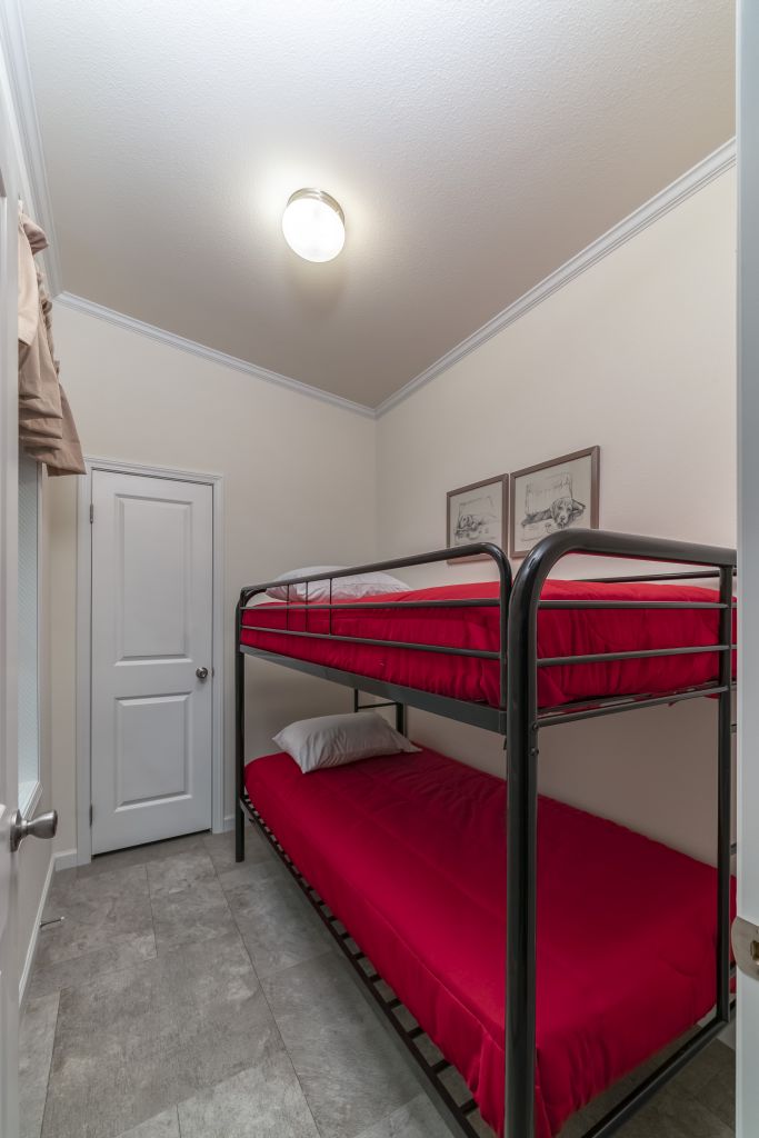
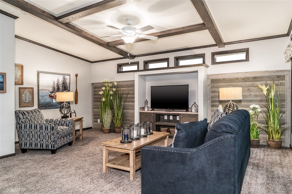
 Our MidCountry Retreats recently have been redesigned. The Prow End on our Retreat Series is now optional! Our 3W140 Retreat Ranch is a two bedroom, two bathroom retreat with a great open floorplan. The retreat has fantastic natural light with an end wall full of windows! The Living Room features optional ceiling beams, an optional built in entertainment center, and optional ship lap accents. The Kitchen features an enormous kitchen island with seating space, prep space, great storage, and the kitchen sink! This kitchen has ample storage space for you retreat, and features Frigidaire Appliances. The Kitchen Nook is just the right size for a dining table, and an optional patio door can be installed off the nook as well. A built-in bookshelf and cabinet is located in the nook, and is a great character piece! The two bedrooms are located off the nook, the secondary bedroom is at the end of the hall, and features a walk-in closet. The guest bathroom is also located here, with a separate entrances from the hall and the bedroom. The Master Bedroom is off the nook hallway and also features a walk in closet, and an attached bathroom. Between the Nook and the bedroom is an optional space, that is standard with a bench and storage closet, but can be a cozy cove, perfect for the kids to play or create a reading nook, a large storage closet for all the things, or a work center with built in desk. The water heater, furnace and stack washer & dryer space are also all located in this hallway. The Retreat series has great appeal for all types of adventurers.
https://www.midcountryhomes.com/homes/westlake-ranch-retreats/3w140a/ranch/?home_id=3644
Sneak Peek into the Kitchen!
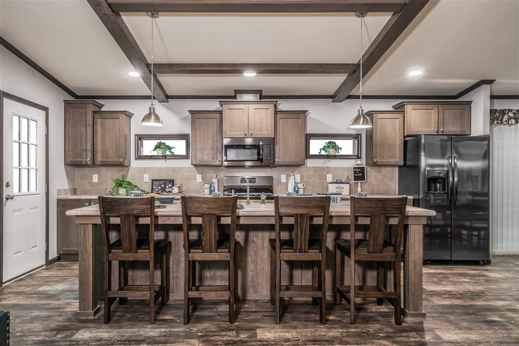
Instant Character added to this Retreat with the ShipLap Accent and Ceiling Beams!
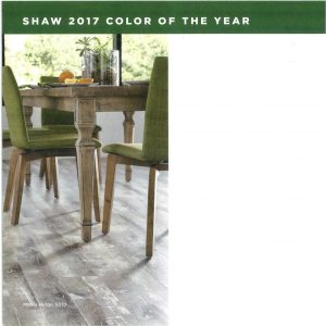
Announcing the color of the year for 2017…green. In various shades and a bit different from source to source but it is in fact green. Quite a big change from the various shades of white a year ago. It follows the influence of botanical looks that surround us and is also acting as a calming agent in our turbulent world right now.
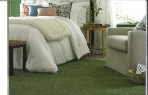
“LUSH” SHAW’S COLOR OF THE YEAR
Lush is nature’s neutral. From the tallest trees to the deepest valleys, green surrounds us. It’s vibrant, but at the same time, soothing. It changes with the seasons without ever getting old or boring. It’s sprouting up in interior design and fashion trends across the world. Lush spans every style, from glamorous to rustic to contemporary. It can be a statement color, and it plays just as nice with jewel tones as it does with popular neutral hues. Lush can also be used as an accent color to pull out subtle hues in a tweed carpet, bold print or throw pillow. Lush is an excellent companion to hardwood flooring. Just as you’d see in nature, Lush greens are an organic complement to the natural beauty of hardwood.
We have launched a new Virtual Home tours page on our website! Talk a tour through the model homes and see the features that set our homes apart!
We also have a tour of our Builder Show, you can see all the homes that were shown at our MidCountry Homes Show! Please note not every home has the tour, but photographs and video are there to see interiors of all homes!